2010/10/03

TV-heads are back


I like to make my TV-heads and I couldn't resist the temptation. The painting is called "It's coming". It's the biggest I have made this far. I would like to make more bigger paintings but I have some logistical problems (it's not nice to carry big ones). You could make the bases yourself, but I'm way too lazy and tecnically ungifted for that.

This painting was really fun to make and it actually looks good on the wall. I know it's missing an ufo or two. The ufo just didn't look good with the big TV-heads and color splatter.

Finally something new


I have been quite busy with other things and so I haven't had time to paint. Well, I have been painting something but those canvases are wainting to be overpainted. But now I have something finished.

I've been planning to paint a remake of my ufotree and now I did it.

The painting is called "After Ufofest". You can figure out why.

2010/09/12

TV-heads


"Ufofest" is the name of my latest very colorful TV-head painting (40cm X 20cm). This one has been in the making for months and I nearly overpainted it more than once. The painting started out with the idea of filling the whole canvas with colorful ufos. The ufos turned out to be way too small (again) compared to my plan but I still kept making them with some leftover paints. Then once I accidentally dropped some red paint on the canvas. That incident ruined the whole thing, so I tossed some more red paint on it just for fun of it. I intended to overpaint it, but then decided to try how it would look as a background for my TV-headed ufomen. I kind of like the end result but I have received some comments of the blood weeping ufos being scary looking.

Next time there will be no TV-heads, I promise.

2010/08/29

Ufo men


This painting started out with a blue ocean with a grey monolith and the sun. It was very boring, so I turned the painting on one side and changed the ocean into a water planet and the monolith into a ufo. Well, that too was just boring as you can see underneath. I didn't come up with anything that would make the painting work and that led to the decision to overpaint the whole thing.

In the new painting I continued my last theme by making some ufo men. I also used the old housing theme. There is no gold paint! I picked the mustard yellow because it's not the one you would normally pick as the main colour. I just wanted to see how I can make it work with the other colours. The painting is called "Meetings at the Hometown" (50cm X 50cm).

2010/08/24

Pictures don't do justice


This one is called "The Merchants of the Space" (33cm X 24cm). The painting has quite dark colours and I had troubles taking the picture. The problem was the darkness and the cold paint combined with the uneven surface. The bumpy surface is due to the fact that there is another painting underneath and the first one had thick layers of paint. I think the underlying layers gives a nice extra for the painting.

I covered the original one with just a one layer of brown paint. The original painting was a painting by a horrible painter, not a bad painter. It was that bad. Believe me, this one is a lot better. I have a picture of the first one but I think I'll skip posting it.

I called the original one the merchants of the space eventhough it really had nothing to do with the merchants or the space. I did like the name though. So, when this one formed on the canvas I decided to keep the name. Again, I was using some red paint in another painting and just wanted to test the some extra paint on the canvas and I ended up with this.

2010/08/15

Silver paint


I saw a picture in a magazine with a electric blue background and a man climbing out of a black hole. Combination of the blue and black hole was so interesting that I decided to use it in a painting. I also wanted use more of the beam theme and that is how I ended up making this painting called "Transportation" (46cm X 38cm). You really don't see the black holes because that idea didn't work that well and I changed them into these tubes. This ufo's window is different, more like the galactica type.

Underneath without the flash. Fuzzyness in the picture comes from the silver paint.

2010/08/14

An old one


I painted this one a month or two ago and I was never happy about it. I quite liked the idea of making a flower with the hungry ufo bees. Well, the flower did not quite fulfill my expectations. I don't draw any outlines on the canvas before I paint and I was not thinking too much about the shape of the petals. I just tought they'll work out just fine, but they didn't. I guess the only reason why I didn't just overpaint it was the sky part. I liked the colour of the clouds. By the way the colours in the picture look a lot worse than they are in reality.

The other picture showes how the painting looked at some point. The whole yellow thing was a big mistake. The ufos were first white and I made then black afterwards. That is one reason why the ufos are even sloppyer than my normal ones.

I named the painting "Temptation", though I doubt it temps anyone. The painting is small 27cm X 22cm.

2010/08/08

Forest


I have wanted to use some green colour for a while and so this time I went for it. The painting is called "The Thing" from Birch Forest. I don't know where the inspiration really came from. I have been spending some time at the summer house this summer and there you can see birches, so maybe the time in the forest has done it's work.

The painting is one of the biggest I have done so far (61cm X 50cm). Maybe the mushrooms were little too much but I have wanted paint them. I actually painted some mushrooms to one of my earlier paintings but I eventually overpainted them.

2010/08/04

Water theme again


I was visiting an younger colleague and we had some time to paint together. I was just painting for the company so I didn't really think too much about the theme and this is what I made. It's called "At Swimming" and it has all the familiar features. The painting is very small, 20cm X 20cm.

Under my painting is the painting that my younger colleague made and allowed me to publish. Unfortunately I don't remember the name of the painting.


2010/07/11

Dog hating hot air balloons


When the air is clear and not too windy people like to take hot air balloon trips and enjoy the nice views. Well, what is nice for the people on the balloons is not good for my dog and the holder of the leash. My dog goes crazy when he sees hot air balloons in the sky. The dog just wants to go somewhere where he can't see the balloons. I googled the thing and found out that many animals don't like balloons because they make some kind of irritating ultrasound noises that humans can't hear. I don't know if it really is the ultrasound or not, but my dog hates them. And he is not usually too jumpy about things.

So the inspiration came from my dogs behavior. The dog is portrayed on the left side of the painting. I was surprised how well the dog turned out. I mean, it looks a little like a rat but at least it looks like an animal. That's something after all. First, I thought of painting the dog from the front but decided to settle with the sideprofile, because I thought it would be easier. The tittle is Aviation Divides Opinions.

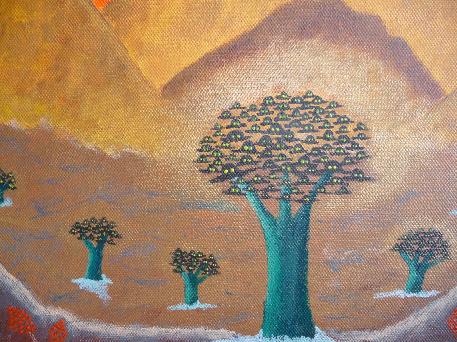
I did most of the painting by using just fingers and a rag. I did use brushes while I was doing the finishing touches. I nearly left out my ufo and gold paint, but just nearly. It just wouldn't be the same without those two elements, don't you think?

2010/07/08

Heat inspired


I have been having this plan of making a painting with just red and black with palm trees and water. Well, it didn't turn out just the way I planned colourwise but otherwise it has all the things I wanted. I don't usually do any sketching before hand, I just get the idea, maybe make a note of it on a piece of paper and later on start painting it. This time I decided to make this on a one go, so it's more "expressive".

The title is The Thing from Miami. It's funny how the red I used looks so orange. I think it's because of the other colours and how they work with the red. This time my ufo looks more spooky, with the lights off and all. It's actually more like a swamp-thing.

2010/06/27

Inspiration from Guatemala

Just about a month ago there were news about a huge sinkhole in Guatemala. You can see some pictures behind this link

http://news.nationalgeographic.com

Very strange looking thing indeed. How did this sinkihole originate? Well, the scientists are not sure. That leaves some space for speculation and inspiration. Here is my impression. The painting is called The Meeting/Seizure at Sao Paolo (Reprise of Guatemala). The part of Sao Paolo came from the recollection how the buildings looked when seen from the window of an airplane. Gold and silver paint worked well with the thrusters/beam/ray.


2010/06/20

Productive is what I am


I've been busy again. I just had this urge to use yellow and the result is this small (20cmX20cm) painting. The Meeting at a Swirl. Here is the same painting with different lighting. And of course the gold paint is there with the ufos.


2010/06/19

Ufo trees


Did you know that the ufos comes from the trees?

According to this they do.

This is called The Meeting of Generations. The picture doesn't do justice for the colours. The trees are actually clearly turquoise but they look something else in the picture. Again, I had to use some gold paint to give the trees a nice golden halo.

Some details...


2010/06/16

Surprise, surprise


I'm just about to give this painting to friends of mine as a house warming gift, again (a great way of finding these painting a new home).

The name of this one is something like A Meeting/Seizure Outside of Town. The colours selected are some of my friends favourites and they themselfs are also included in the painting. They are the couple emerging from the big doorway with the golden rays. The big, black thing is NOT a hill, a mountain or a tomb, like some people have guessed before. It's a ufo, of course.

The red things in front of the ufo are not flowers, like some people might first think. They are the local people (red men with dots on their backs) who have come to witness this great miracle of two humans. You can decide if the red heeled lady is having a fit or just greeting the locals.


2010/06/15

Ufo attack


This time I went for something bigger (80cm X 40cm) and the space theme. I also wanted to use more of my metallic paints. That's why I have these golden ufos with silver windows and the big copper-red planet. I may have gone a little over board with the amount of the ufos but they a so nice to make.

Just that you know, that big red planet and some of the other planets have been hit by asteroids and that explains the not so round appearance...the space is a dangerous place.

The name is Spatial Meeting.

2010/06/13

Loving the gold paint


This is The Meeting at the Pyramids. First I just painted the background with the gold paint. The pyramids just happened on their own with the ufos, of course. I like the colours in this one. Again there are some little green men represented by the green dots, this time also pink ones.


The theme seems clear


This master piece is called The Mass Meeting. I just wanted to paint something with a kind of blood red colour. So, I made the background with red. Then I was painting or mixing colour for something else and ended up with this extra dark purple colour and decided to use it on this red painting. I then toped the purple with white. Of course I had to make a planet to go with the ufos. The planet actually has 3 green men on top of it.


Here is another one. This one is quite colourful and that's about it. It's called Quite a Meeting. It did not turn out to be like I wanted it to be. I had problems with the lower part and I finally gave up and just made this pink growth. Well, I didn't have problems with just the lower part, I would say with all of it. I actually first painted something else under it and this one was done to cover it. (later the x-ray guys can see what the original painting looked like...).


2010/06/11

Cones are cool


This one was inspired by my friends who were moving to a new place. The new area has a word "cone" in it's name. The painting has the earth, the cone on top of it and then the new house. On top of the building is the green alien guy with the orange dressed afro man. Orange dressed man was inspired by a guru man on a sticker that I gave to my friends. I was first thinking of painting my friends also on top of the building with the alien and the afro man, but then I was thinking that it would be too crowded on the roof. Instead I painted some figures watching out of the windows.

The building is really badly done, but I got bored of trying to make it right. At least the building is somehow recognizable. I like the blue colour and I had to buy gold paint for the ufos.

I gave the painting to my friends as a house warming gift and they commented: "after painting all the walls white, we were thinking of leaving the walls into this zen-style minimalism". But they both liked the picture book that I also gave to them.

2010/06/10

Becoming a bad painter


Everything started with the sale. Art supplies were on sale and I decided that it was finally the perfect time to let the little painter in me to flourish. Many will suffer because of that sale.

My first real inspiration came with the Islandic volcano eruption. The whole Europe was halted by it, so why not make a painting about it. What would be easier to paint than a volcano? But volcano just itself was boring, so I needed something else and so I came up with the great idea of painting some 1950's style ufos with the volcano. I mean, who doesn't like ufos? And they are really easy to paint.

My first master piece is called The Meeting/Seizure of Katla. Katla is the name of the Islandic volcano that has not erupted, yet. Painting is very small, about 20 cm X 20 cm. Just to make it clear, the little light green dots on the right lower part are the little green men and the orange/white dot the local earth man.